Design
FantasyBowl "Geometric" Logo
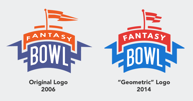
By 2013 FantasyBowl's old 2006 logo was looking a little long in the tooth. It had numerous issues, lack of symetry, outdated colors, font problems and overall was a bit too "pointy". In 2014 that was resolved with the new "geometric" version of the logo, complete with an updated color scheme.